Brand & Identity
The kinds of piece that make up a brand's identity, the other names people use for them, and the words for the parts they are made of
How to answer this page. Every decision below ends with its own answer line. Reply in chat, one line per decision, in any order: ID: CONFIRM · ID: CHANGE: what you would change · ID: LEAVE OPEN: what you still need to see — plus anything else you want on the record. Every number on this page was read from the database on 2026-08-25; the queries are stored beside the values.
B-01Four other names for kinds we already have · full
Should Brand Book, Style Guide and Digital Guidelines all save as Brand Guidelines, and Key Art save as Key Visual?
| What is written on a piece like this today? | Usually the catch-all word “brand asset” — it sits on 13 pieces and tells you nothing. |
|---|---|
| How many kinds of piece does Brand & Identity hold? | Six. This review read your sources end to end and proposes no seventh. |
| What is new here, then? | Four spellings that people really use, pointed at kinds we already have. |
| What happens if someone types Brand Book? | It saves as Brand Guidelines. Style Guide and Digital Guidelines do the same; Key Art saves as Key Visual. |
| Does anything get written on a piece? | No. This changes the list of words the library understands, not the pieces. |
Two words in the line under the title are shorthand, so here they are in full before the first decision. A shelf is a group of kinds of piece that you browse together under one name; this one is called Brand & Identity. The element vocabulary is the second list this page deals with — not what a piece is, but what a piece can show: a palette, a typeface, a grid. Every decision below belongs to one of those two lists, and most of them belong to the second.
Every piece we save carries one word that says what kind of thing it is — we call that its type. On 16 August you settled what this group of kinds is called, in your own words: lets ensure we call it “Brand & Identity”. And you asked for the vocabulary behind it to be pulled out of the sources you named: your own brand-identity spreadsheet, all 133 rows of it; GitHub's brand guidelines book, the 2025 edition, 73 pages read end to end; the OpenAI guideline pages made by Area 17; and your motion framework. Those two figures came from the sources themselves rather than from the library — the rows were counted in the spreadsheet, the year is the edition sitting on file — and both are stored with the working behind them, the same way every number here that was read from the database is stored with the query that read it. This is what came back.
The word doing the work today is “brand asset”, and it is doing far too much of it. 13 pieces carry it: a motion identity loop from the DevDay job, a photograph of embroidered character patches from the same job, and everything else nobody had a better word for. You cannot browse that. You cannot tell from the word whether you are about to open a film, a photograph or a book.
The good news first: the pull from your four sources proposes no new kind of piece. The six kinds on the list you approved in August for this group hold up — Key Visual, Logo Animation, Product Shot, Template, Brand Guidelines and Icon System. One thing to hold in mind about that list: it lives in your rulings, not yet in the system. Only one of the six, product shot, exists as a word the system knows and is written on any piece; the other five are names you approved that nothing has started writing yet — so a spelling that points at them is a promise about future pieces, not a change to stored ones. What it found instead was four spellings of kinds we already have. Your spreadsheet's brand-management rows call the same object a Brand Book, a Style Guide and Digital Guidelines, depending which row you are reading; the GitHub book calls its nine hero illustrations Key Art. None of those is a different kind of thing. A Brand Book is a Brand Guidelines book. Key Art is a Key Visual.
So the proposal is small and it is a safety net rather than a change: those four words resolve on the way in. Someone types Key Art, the library stores Key Visual, and the piece lands where you would look for it. The DevDay motion identity loop below is the case that makes it concrete. It says “brand asset” today, and it is plainly one of the six: a logo animation, or a key visual if you read the loop as artwork rather than as a moving mark. The separate decision that splits that catch-all word up is where those 13 pieces get their real word. This call is only the four spellings.
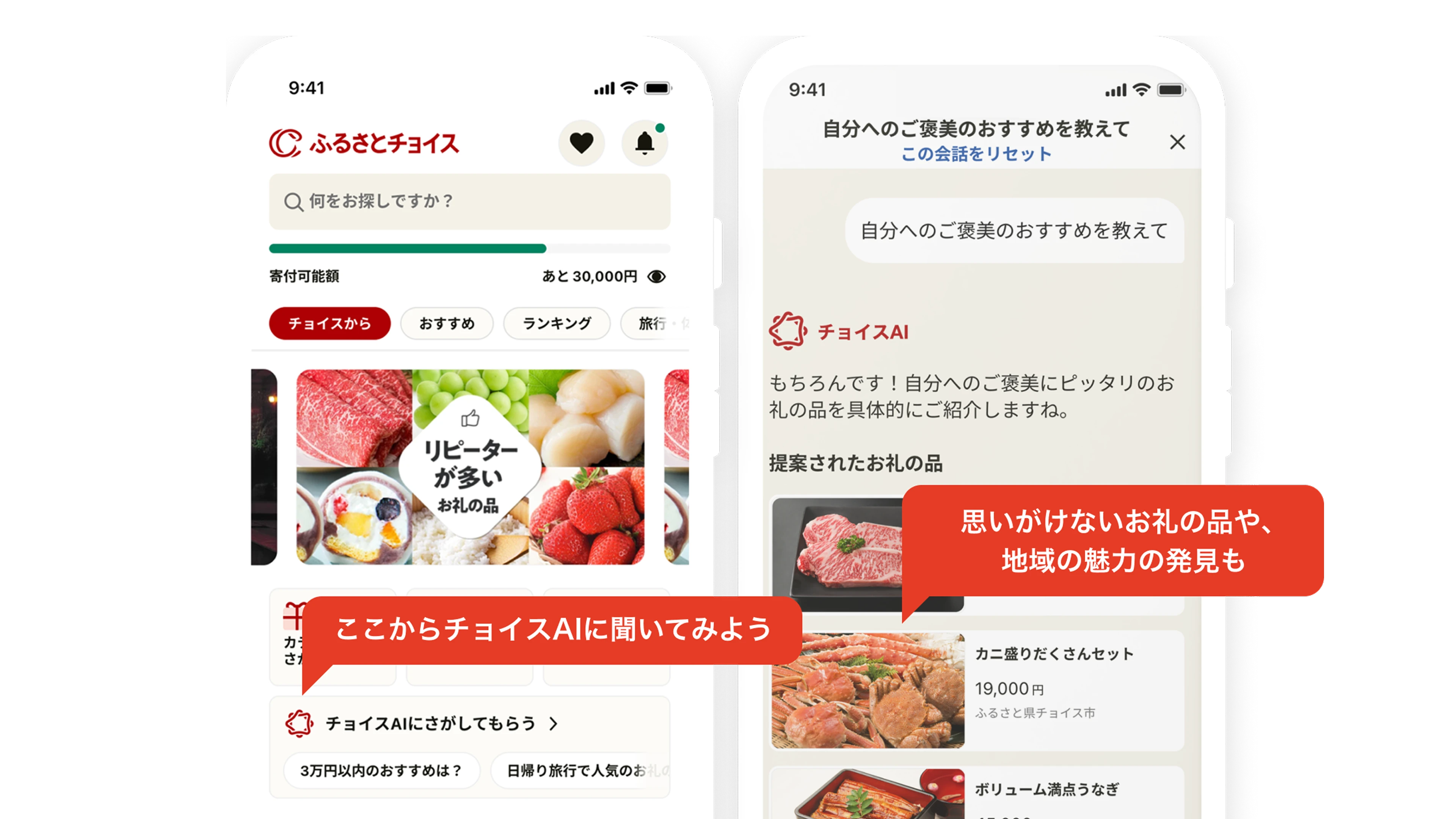
Nothing here is written on any piece. Confirming adds four spellings to the list of words the library already understands — it knows 74 words for what a piece is, 53 of them switched on — and it changes nothing that is already stored. The one live word among the six is product shot, on 10 pieces — the Choice AI phone screens from the Furusato Choice app, the third piece above, is one of them; those pieces keep it exactly as it is.
My take: Confirm all four. They cost nothing, and they are the only thing standing between you and the same guidelines book filed under three different names.

OpenAI · a studio's portfolio · 2026-07-20 · written on it: brand asset · source

OpenAI · a studio's portfolio · 2026-07-20 · written on it: brand asset · source

OpenAI · its own website · 2026-06-06 · written on it: product shot · source
What changes
Four spellings resolve on the way in: Brand Book, Style Guide and Digital Guidelines all save as Brand Guidelines; Key Art saves as Key Visual.
The list of words the library understands grows by four. Nothing is removed from it.
What stays exactly as it is
The six kinds themselves — Key Visual, Logo Animation, Product Shot, Template, Brand Guidelines, Icon System. The review proposes no seventh.
Every piece already written as a product shot — 10 of them — keeps that word, untouched.
The 13 pieces carrying the catch-all word stay where they are until the decision that splits it is made. This call does not move them.
| Pieces carrying the catch-all word “brand asset” today | 13 |
|---|---|
| Pieces already written as a product shot | 10 |
| Pieces written as key visual today | 0 |
| Pieces written as brand guidelines today | 0 |
| Words the library understands for what a piece is | 74 |
What this call does to everything else written on these pieces
Nothing else written on these pieces is touched. The DevDay motion identity loop keeps OpenAI as its owner and Studio Dumbar as the studio that made it; it keeps Motion Graphics and Brand Copywriting as its crafts; it keeps Sora, AgentKit and Codex as the products in it; it keeps the jobs it does — awareness, category leadership, explanation — and it keeps its link to the OpenAI DevDay campaign, which is the link that decides which saved view it turns up in. The same holds for the patches and the Choice AI screens above: companies, crafts, products, the job each does, the themes on them and anything else hanging off them are all left exactly as they are, because this call writes to the list of words and never to a piece.
The alternative, and its cost: Leave the four spellings off, and take each of them as a new kind of piece the day it turns up. The cost is quiet and permanent: the same object then sits under two or three names at once — a Brand Book here, a Style Guide there — and browsing Brand Guidelines shows you only some of what you own. The alternative that is not on the table is renaming your sources' words to ours; their words are what people will type.
Where this was worked out: the Brand & Identity review page, section 1 — the piece kinds and the four other names, each traced to the source it came from
B-01: CONFIRM · B-01: CHANGE: what you would change · B-01: LEAVE OPEN: what you still need to seeB-02What a piece can show — the visual list · full
Does the visual list of 22 things a piece can show read right to you, including the four that GitHub's guidelines book forced onto it?
| What is this list for? | Not what a piece is — what it shows. A logo mark, a palette, a typeface, a pattern, a grid. |
|---|---|
| Where did the rows come from? | Your own brand-identity spreadsheet, all 133 rows of it, with the source cited on every line. |
| How many are in the visual group? | 22 — and 18 of them are your own words handed back to you. |
| Which four are not yours? | Topic colour themes, gradient systems, shape systems and mascots. All four came out of GitHub's brand guidelines book. |
| Does anything get written on a piece? | No. It settles words only. How finely a tag like this would attach — to a whole piece, or to one part of one — is worked out and written down before anything is stored. |
A kind of piece answers what something is. This second list answers a different question: what does the piece show? A logo mark, a lockup, a colour palette, a typeface, a photography style, a pattern, a grid. Keeping those two questions apart is the whole trick, because one guidelines book contains dozens of these and is still a single piece you can open.
Most of the 22 rows in the visual group are your own words handed back to you. They were read out of your brand-identity spreadsheet — all 133 rows of it — and every line carries the source it came from, so you can check any of them: logo marks and lockups, sub-brand and partner lockups, badges and seals, app icons and avatars, primary and secondary and functional palettes, typefaces and the type scale, photography and illustration styles, iconography, patterns and textures, chart style, layout and grid. If that reads as obvious, good — it is meant to. The Choice AI phone screens below are those familiar rows all working at once: a typeface, a palette, an icon set and a grid, on one image that is itself just a product shot.
Four rows are not yours, and those are the ones worth your time. All four came out of GitHub's brand guidelines book, which plainly governs things your spreadsheet has no row for. Each one is worth a paragraph.
The first is a topic colour theme: a palette reserved for a subject rather than for a brand. GitHub's colour pages keep blue for anything about security and purple for anything about AI, so a reader knows what a page is about before reading a word of it. That is a real, ownable rule, and it is not the same fact as “the secondary palette” — the secondary palette says which colours you may use, and this says what one of them means.
The second is a gradient system, and this is the one that reads as a hunch until you look at it. The row came from GitHub's gradients page, where background gradients are written down and governed the way a palette is. Behind that sits the wider practice: design teams now write a system down so that design tools and code can share it, every value named once and defined once — this colour, this type size, this spacing — and designers call those named values design tokens. In that shared way of writing a system down, a gradient is one of the named values in its own right, sitting alongside colour rather than being lumped in as artwork. That is what the review meant when it said the design-token standard makes gradients first-class, and it is the whole of the claim: not that gradients are nice, but that the industry already treats one as a defined, reusable part of an identity. The header art on “A practical guide to building agents” below is what that looks like in your own library — a wash of green, blue and peach, no logo, no type, no subject. There is no honest way to describe that picture without naming the gradient.
The third is a shape system: a small vocabulary of shapes a brand builds its artwork out of, governed the way a palette is governed. GitHub publishes its grid of shapes as a named system with its own rules — it calls that grid the Git-Grid — and keeps a shape library built out of it. Your spreadsheet treats shape as something that happens inside a layout; the book treats it as a thing you own.
The fourth is the mascot, and it is the one I would argue hardest for. GitHub runs pages of usage rules for its named characters: Mona, Copilot and Duckie each have their own. The embroidered patches below are the same idea sitting in your own library: one photograph, one piece, and what it shows is a character set, a palette and a texture all at once. A named character system is as ownable as a wordmark, and your spreadsheet simply predates the practice rather than having ruled against it.
Nothing on this list is written on any piece today, and confirming it writes nothing. It settles the words. Where these tags would eventually sit — on the whole piece, or on one part of one — is worked out and stated before anything is stored.
My take: Take all four, and mascots most of all: a named character system is a real, ownable part of an identity, it is all over the wild, and your spreadsheet simply predates it.
OpenAI · its own website · 2026-06-06 · written on it: product shot · source

OpenAI · its own website · 2026-06-23 · written on it: blog post · source

OpenAI · a studio's portfolio · 2026-07-20 · written on it: brand asset · source
What changes
Four things join the list of what a piece can show: topic colour themes, gradient systems, shape systems and mascots.
The gradient row stops being a hunch. It is backed twice over: by GitHub, which publishes governed gradients as part of its own identity, and by the way the wider industry writes a design system down, where a gradient is a named, reusable value in its own right.
What stays exactly as it is
The familiar rows, read back from your own spreadsheet: logo marks and lockups, palettes, typography and type scale, photography and illustration styles, iconography, patterns, chart style, layout and grid.
The split itself. This list never holds kinds of piece: an icon set that ships as its own deliverable stays a kind of piece on your approved list (nothing is stored under it yet), while the icon rules a piece merely shows stay on this list.
Nothing is written on any piece by this call, and where these tags would eventually live is not decided here.
What this call does to everything else written on these pieces
Nothing written on any piece changes, because this call writes nothing on a piece at all — it settles a vocabulary. The patches above keep OpenAI as their owner and the studio that made them beside it, keep Product Photography and Graphic Design as their crafts, keep the jobs they do — awareness and community — and keep their link to the DevDay campaign. The one thing to watch is the seam with the kind of piece. An icon set that ships as its own deliverable is a kind of piece; the icon rules a piece merely expresses belong on this list. The same split holds for a logo animation against the movement rows further down this page. Get that seam wrong and the two lists start counting the same object twice, which is exactly why they are kept apart.
The alternative, and its cost: Leave the four new rows off and keep only what your spreadsheet already had. The cost lands on real pieces rather than on paper: the patches above would have nothing on this list to say what they show, the gradient art would have nothing better than “photography style”, and the security-blue and AI-purple rule that GitHub runs its whole colour system on would have no home at all. Adding a row later costs nothing — but every piece filed before you added it stays untagged for it, and nobody goes back.
Where this was worked out: the Brand & Identity review page, section 2 — the visual group, with the source cited on every row
B-02: CONFIRM · B-02: CHANGE: what you would change · B-02: LEAVE OPEN: what you still need to seeB-03The words a brand owns, and the strategy behind them · short
Do the verbal list and the strategic list both stay, with the honest note that the strategic rows describe the brand rather than the piece?
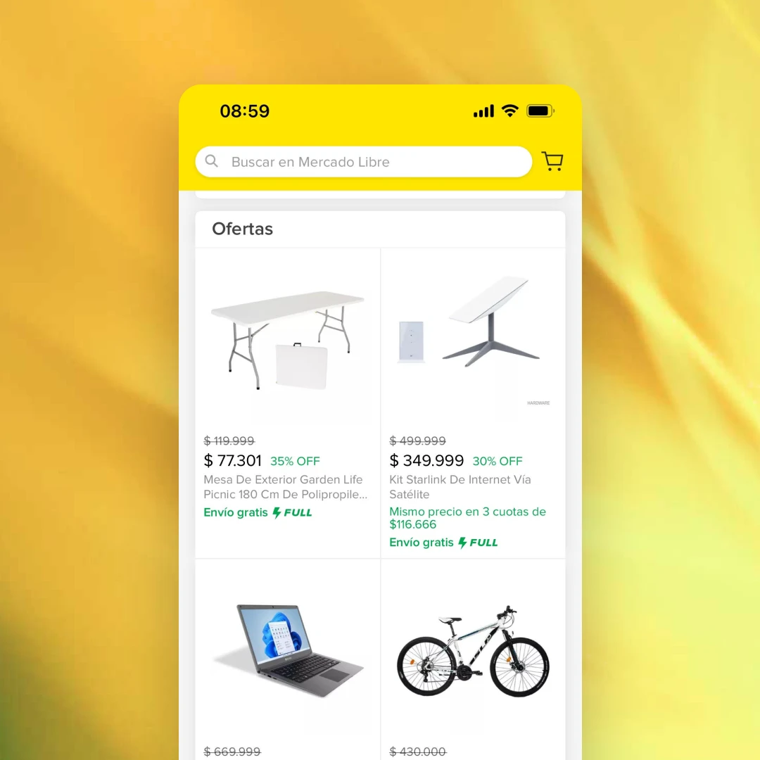
The verbal list sits beside the visual one as an equal, and it is uncontroversial: voice, tone, key messages, taglines, calls to action, naming, terminology, and the mission and values statement that both guideline books open with. The strategic list is the one that needed a flag — purpose, values, promise, brand architecture, value proposition, differentiation, competition view and audience definitions describe the brand, not the thing in front of you, so they are kept because your spreadsheet files them here, and flagged honestly as a different kind of fact. Look at the two screens below: on the Choice AI phones the words are voice and key messages doing visible work, and on the Mercado Libre offers card it is the offer and price language doing it, while the promise behind either belongs to the brand and not to that one image.
My take: Keep both, keep the flag. The strategic rows are worth having written down somewhere, and pretending they are things a piece shows would quietly poison every count you ever run.
OpenAI · its own website · 2026-06-06 · written on it: product shot · source

OpenAI · its own website · 2026-06-06 · written on it: product shot · source
What changes
Nothing moves. The strategic rows simply carry a plain note saying they describe the brand rather than the piece.
What stays exactly as it is
Both lists exactly as your spreadsheet has them.
The audience rows keep pointing at a call you already made: that an audience — developers, small businesses, healthcare teams — is a thing the library keeps a record of in its own right, not just a word typed onto a piece. Nobody has written out the actual list of audiences yet, and it is still owed. When it is written there should be one list, kept where the list of crafts is kept — crafts being the skills a piece is made with, motion graphics or copywriting or photography — so that a brand's strategy record and a piece's tags are always reading the same names off the same list, rather than two lists drifting apart.
Where this was worked out: the Brand & Identity review page, section 2 — the verbal and strategic groups
B-03: CONFIRM · B-03: CHANGE: what you would change · B-03: LEAVE OPEN: what you still need to seeB-04Sound, and movement · full
Do we keep movement as a group of its own, the way your motion framework has it, when the big guideline platforms file it underneath digital?
| What is a group, on this list? | A heading in the list of what a piece can show. Colour is one, type is one, sound is one — the question here is whether movement gets its own. |
|---|---|
| What does your own motion framework say? | That movement is a system in five layers, each one setting the limits for the next: a north star, then principles, then behaviours, then gestures, then the system that ships it. |
| Where does the industry put movement? | Underneath digital. One big platform files “video and motion standards” under digital and product usage; another's list of identity elements stops at logo, colour, typography, imagery and voice. |
| So what is actually being asked? | Whether to follow them or follow your framework. Keeping movement at the top is our own extension — argued, not copied. |
| Does anything get written on a piece? | No. This decides where a heading sits in a list. No piece is touched either way. |
Sound comes first because nobody argues with it: a sonic logo, brand music, voice talent, interface sounds. Four rows, straight from your own spreadsheet, and they go in as they are.
Movement is the argued one, and it is worth being slow about, because this is the one place on this page where we are not simply handing your own words back to you. Your motion framework treats movement as a system in five layers, each one setting the limits for the next: a north star that says why anything moves at all; principles that say what movement always feels like; behaviours that say how it executes in a particular moment; gestures — press, expand, lift, settle, stagger, overshoot — which are the concrete mechanics; and last the system that ships it, the durations and easings, and the gentler version of every one of them for people who ask their device to reduce motion. That is not a decoration hanging off the digital work. It is a governed part of an identity, described at the same depth as a colour system.
The honest note, added to the review page on 17 August rather than quietly left off: the big brand-guidelines platforms do not agree. One of them files “video and motion standards” under digital and product usage, as a sub-heading. Another's canonical list of identity elements stops at logo, colour, typography, imagery and voice — movement is simply not on it. So if you want the industry default, the industry default is to subordinate movement, and confirming this means knowingly departing from it. That is why this one is written out at length rather than waved through.
The argument for departing is in your own library, and both pieces are below. The motion identity loop from the DevDay job is a real thing you can open, and there is almost nothing to say about it except how it moves — the point of the piece is its behaviour over time, not its palette and not its type. The embroidered patches beside it come from the very same job, for the same company, made by the same studio, and need no movement row at all. That is the line this group draws, and it is the same test every other group on the list has to pass: some pieces are about this and most are not.
The second reason is that movement is the thing modern identities differ on most, and a sub-heading under digital is where facts go to be ignored. Filed underneath, the five layers flatten into a note about interface animation. Filed at the top, they read as what they are: a system with a north star, the same shape as a colour system with a primary palette. The cost of the wrong choice is not an error, it is an omission — nobody ever asks a piece what its movement principles are, because the question is not on the list.
Confirming writes nothing on any piece. Logo animation stays a kind of piece on your approved list — a shipped deliverable you can open, sitting alongside product shots and guidelines books; nothing is stored under it yet, and the same two words already name a detail on 52 moments inside videos, a separate list worth knowing about when this label starts being written — and the five layers are what such a piece expresses, not a second kind of thing. The only thing that changes is where a heading sits in a list, which is exactly why the reverse move stays cheap for as long as you want to leave this open.
My take: Keep it at the top level. Your framework is more thought-through on this exact point than the platforms' lists are, the library already holds pieces that are about nothing else, and if you ever disagree, filing movement underneath digital later is a one-line change that costs nothing.
OpenAI · a studio's portfolio · 2026-07-20 · written on it: brand asset · source
OpenAI · a studio's portfolio · 2026-07-20 · written on it: brand asset · source
What changes
Movement stays a group in its own right rather than a sub-heading under digital, with the honest note about where the big platforms put it kept on the page beside it.
The five layers become the words available for describing how a piece moves — a north star, principles, behaviours, gestures, and the system that ships them.
What stays exactly as it is
Logo animation stays a kind of piece on your approved list — a shipped deliverable you can open, with nothing stored under it yet. The five layers are what that piece expresses, not a second kind of thing.
Sound's four rows go in unchanged: sonic logo, brand music, voice talent, interface sounds.
Nothing is written on any piece; this is where a heading sits in a list, and the list is not written onto anything yet.
What this call does to everything else written on these pieces
Nothing written on any piece changes, because this call writes nothing on a piece — it decides where a heading sits in a list. The motion identity loop above keeps OpenAI as its owner and Studio Dumbar as the studio that made it; it keeps Motion Graphics and Brand Copywriting as its crafts; it keeps Sora, AgentKit and Codex as the products in it; it keeps the jobs it does — awareness, category leadership, explanation — and it keeps its link to the OpenAI DevDay campaign, which is the link that decides which saved view it turns up in. The patches keep the same owner and the same studio, keep Product Photography and Graphic Design as their crafts, keep awareness and community as the jobs they do, and keep the same campaign link. The one thing to watch is the seam with the kinds of piece. A logo animation is a kind of piece — a thing you can open; how a piece moves belongs on the list of what a piece shows. Get that seam wrong and the same object is counted twice, once as a thing and once as a property of itself, which is the same trap the visual list has to stay out of.
The alternative, and its cost: File movement underneath digital, the way the big platforms do. The cost is not administrative: a five-layer system with a north star at the top does not survive being made a sub-heading of screen work, and the loop above stops having a home that describes what it actually is. The honest counterweight is that this is the cheapest decision on the page to reverse — moving a heading touches no piece — so if you would rather match the industry now and revisit it when the library holds more work of this kind, that is a defensible call rather than a wrong one.
Where this was worked out: the Brand & Identity review page, section 2 — the audio and motion groups, plus the note added on 17 August about where the industry files movement
B-04: CONFIRM · B-04: CHANGE: what you would change · B-04: LEAVE OPEN: what you still need to seeB-05Places and screens · short
Do the environment and digital lists stay as your spreadsheet has them?
Eight more rows across two groups, all lifted straight from your own spreadsheet: environmental graphics, retail design, exhibition design and workplace design on one side; web and app design systems, responsive rules and the app icon suite on the other. The environment rows are the bridge to the retail work you asked for on 16 August — a store's design system is identity, and the endcap built out of it is a piece you can photograph. The Mercado product visual below is that same split on a screen — the design system that yellow storefront obeys is identity, and that one image is the piece — and the Choice AI phone screens beside it are the digital rows doing the same job inside another company's app.
My take: Confirm both. They add no new idea, and the retail design row is the hinge that keeps the retail expansion and this vocabulary from arguing with each other later.
OpenAI · its own website · 2026-06-06 · written on it: product shot · source
OpenAI · its own website · 2026-06-06 · written on it: product shot · source
What changes
Nothing new is proposed. The eight rows simply take their place in the list of what a piece can show.
What stays exactly as it is
Retail design stays a row in this vocabulary and Retail & Commerce stays a group of piece kinds. The two never merge — one is what a piece obeys, the other is what a piece is.
Your spreadsheet's interface-component rows — buttons, forms, navigation — stay folded into the web and app design systems rather than listed separately.
Where this was worked out: the Brand & Identity review page, section 2 — the environment and digital groups
B-05: CONFIRM · B-05: CHANGE: what you would change · B-05: LEAVE OPEN: what you still need to seeB-06The seven found but not proposed · full
Do you want any of these seven — eBook, one-pager, speaker card, email header, blog header image, social post graphic, wallpaper — as kinds of piece in their own right?
| What are the seven? | eBook, one-pager, speaker card, email header, blog header image, social post graphic, wallpaper. |
|---|---|
| Where did they turn up? | Two in the documentation and editorial world; the other five together, as downloadable templates in one guideline book, pages 61 to 63. |
| Why was none of them proposed? | Each names the file you get, or the slot the piece lands in — not a different kind of thing. |
| What happens if you name one? | It joins as a proposal and gets its own working-out before a word of it is written anywhere. |
| What happens if you name none? | Nothing changes, and all seven stay recorded on the review page either way. |
Seven real kinds of thing turned up in your sources and were deliberately not proposed for this group. They are listed here so that none of them is quietly lost: eBook and one-pager, which belong with documentation and editorial pieces rather than with identity; and speaker card, email header, blog header image, social post graphic and wallpaper, all five found together as downloadable templates in one guideline book, pages 61 to 63.
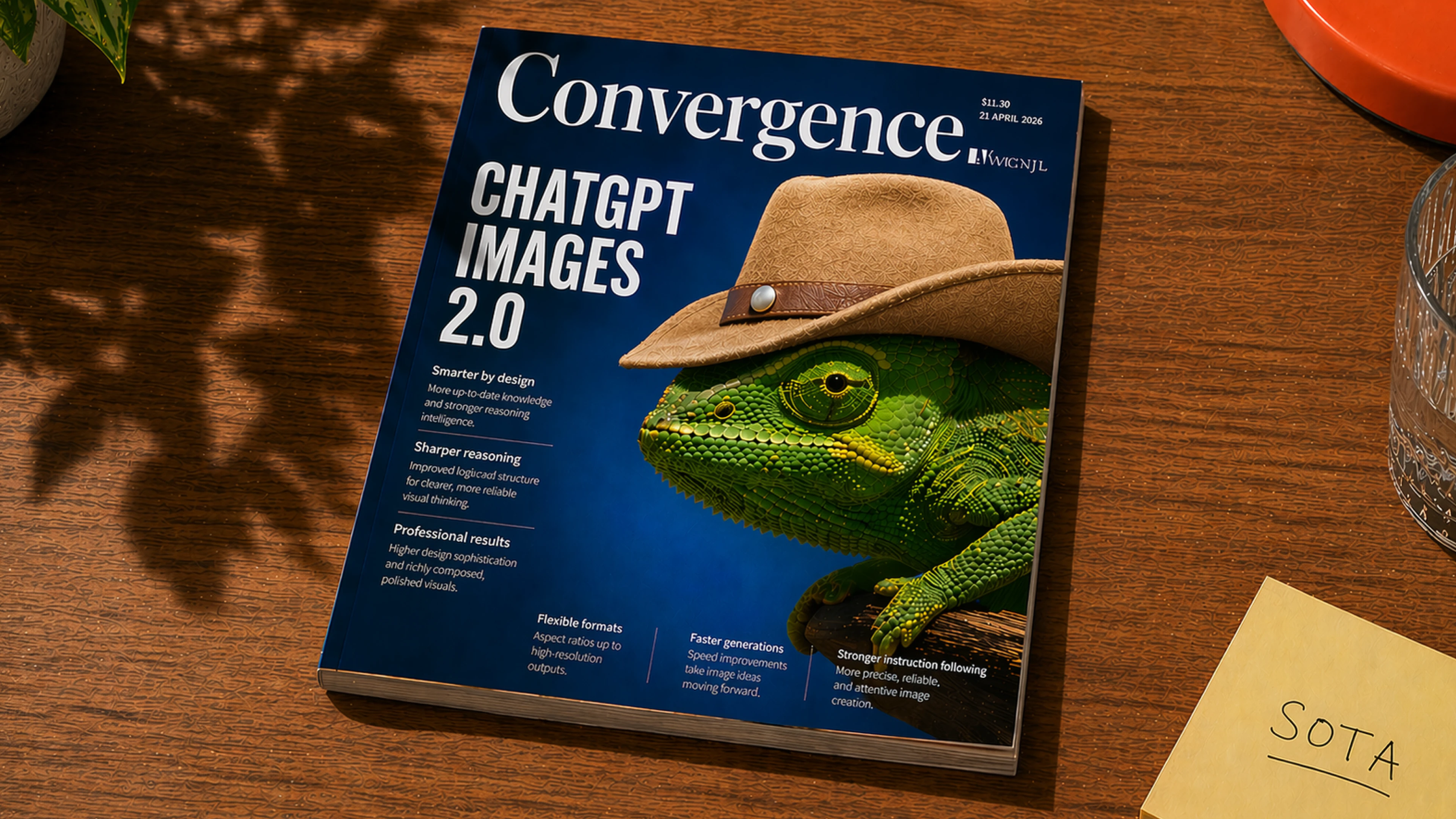
The reason none was proposed is a test worth saying out loud: most of these words name the file you get, or the slot the piece lands in — not a different kind of thing. Two real pieces from your own library make that case better than the argument does, and both are below.
The first is the picture below, the Images 2.0 blog art card: a photographed magazine cover, a chameleon in a cowboy hat on a wooden table, made to head the announcement of ChatGPT Images 2.0. Call it a blog header image and all you have described is where it was placed. Call it what it is and it is a key visual — made once, sitting today at the top of a blog post, and just as happy at the top of an email or on a poster. It is stored as a blog post right now, which is the same confusion running the other way: the announcement is the piece and this is the artwork on it.
The second is the picture beside it, from the Instagram post where the company changed its profile picture — a hand-drawn version of its own app and its own profile page, scribbled on purpose. Call that a social post graphic and you have again named the slot, Instagram, and said nothing at all about what it is. What it is, is an illustration. The library already records where a piece ran as a fact of its own, so nothing is lost by refusing to write the slot into the kind — and something is gained, because the two can never then disagree.
eBook and one-pager are the two I would treat differently, and the reason is that they really are different objects. A downloadable book you keep is not a web article, whatever it is about, and no amount of squinting turns one into the other. But they belong with your documentation and editorial pieces, so this group is the wrong place to rule on them.
The review page's own instruction is “If you want any of them first-class, mark it”, and until you do, none of them joins any list.
My take: None of them here. If you want one, eBook is the strongest — a downloadable book is a genuinely different object from a web article — and it belongs to the documentation group rather than this one.

OpenAI · its own website · 2026-06-06 · written on it: blog post · source

OpenAI · Instagram · 2026-06-06 · written on it: social post · source
What changes
Nothing, unless you name one. Anything you name joins the list as a proposal and gets its own working-out before it is written anywhere.
What stays exactly as it is
All seven stay recorded on the review page whatever you decide, so nothing is lost by leaving them off.
The things that failed the same test stay off too: the shape library kept in Figma, the asset generator and the folder structure in the shared drive are tools for handing work over, while logo clearance rules and do-not lists are the content of a guidelines book — none of the five is a piece.
Your spreadsheet's brand-operations rows stay off both lists as well: asset management, launch strategy, training, governance and measurement describe how a brand runs its identity, not anything you can open.
| Pieces stored under the blog-post word today — the art card above is one of them | 290 |
|---|---|
| Pieces stored under the social-post word today — the carousel image above is one of them | 2,518 |
What this call does to everything else written on these pieces
Nothing written on any piece changes either way, because not one of these seven words exists anywhere yet. Both pieces above keep everything they already carry: the art card keeps OpenAI as its owner with ChatGPT beside it, keeps Graphic Design and Brand Copywriting as its crafts, and keeps the jobs it does — awareness, category leadership, explanation, product validation. What a mark here would touch is the list of words available for the kind of piece, and nothing else: where a piece ran, who owns it, what is in it and which campaign it belongs to are all stored separately and stay exactly as they are. The one thing to watch is what happens if a slot word is taken in. A picture written as a social post graphic, on a piece that separately records that it ran on social, is the same fact stored twice — and two copies of one fact eventually disagree.
The alternative, and its cost: Take one or more of them anyway. The honest cost is not the row — rows are cheap — it is that a slot word written into the kind of piece competes with the fact the library already stores about where a piece ran, and sooner or later the two say different things about the same picture. The counter-case is real for eBook and one-pager, which are genuine objects rather than slots: if you want those, take them into the documentation group where they belong rather than into this one.
Where this was worked out: the Brand & Identity review page, section 1 — the kinds found in your sources but not proposed, and the paragraph beside it on what failed the same test. This decision was added late in the walk: the review page asked you to mark this list and nothing had been written up for it
B-06: CONFIRM · B-06: CHANGE: what you would change · B-06: LEAVE OPEN: what you still need to see